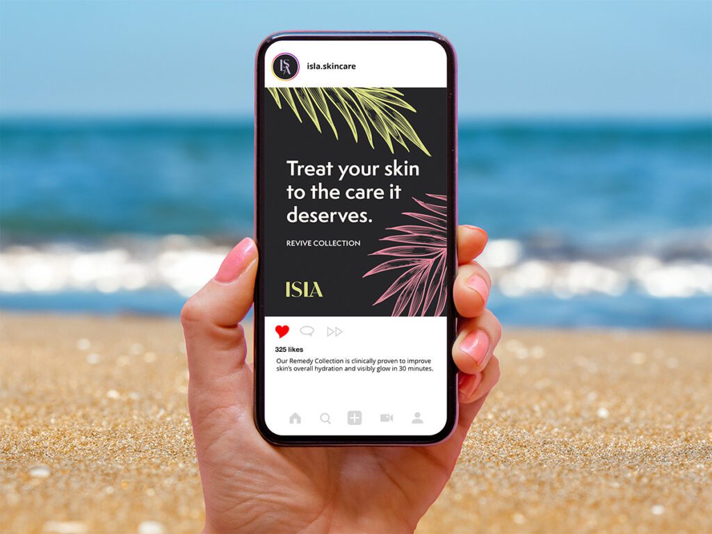
Project Overview
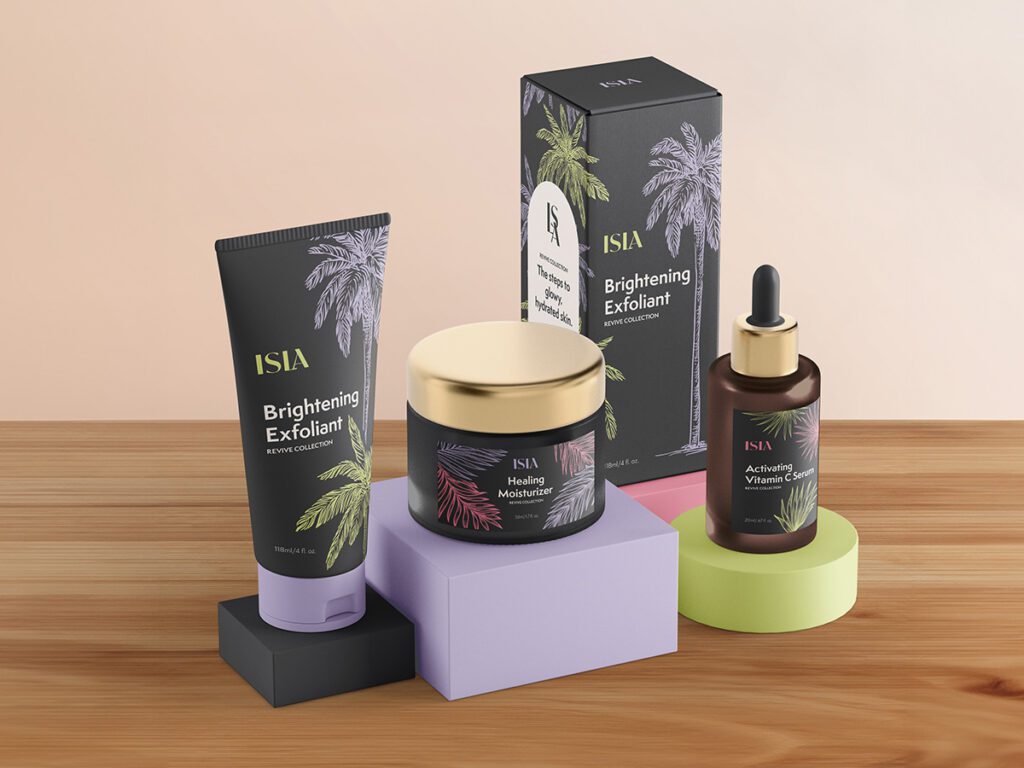
The client is a fictitious skincare brand named “Isla.” They were launching a new skincare line called the “Revive Collection” and wanted to update their branding and packaging. The Revive Collection featured three new products: exfoliant, vitamin C serum, and moisturizer.
© Qualit Design/Adobe Stock
Project Scope:

Brand Strategy
Client Goals
Audience
Our client persona focused on Olivia. She is 35 years old, married, and without children. She works as a lawyer and loves to travel. She has concerns about aging due to stress, sun exposure, and work, and is looking to maintain her skin’s youthful appearance. She values luxury and indulgence and is willing to pay extra for premium skincare products.
Messaging
While some skincare brands focus on the science of the ingredients, Isla focuses on the positive results of using their skincare. Their brand language focuses on words like brighten, activate, heal, hydrate, and glow.
Personality
The core values of Isla Skincare are high quality, innovative, striking, and positive. These elements drove our brand design.
Visual Identity
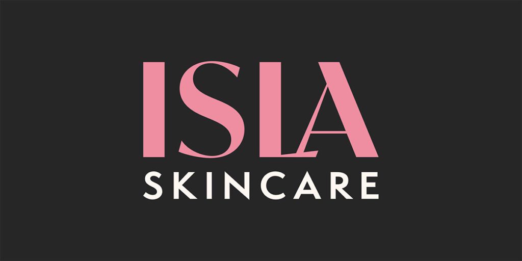
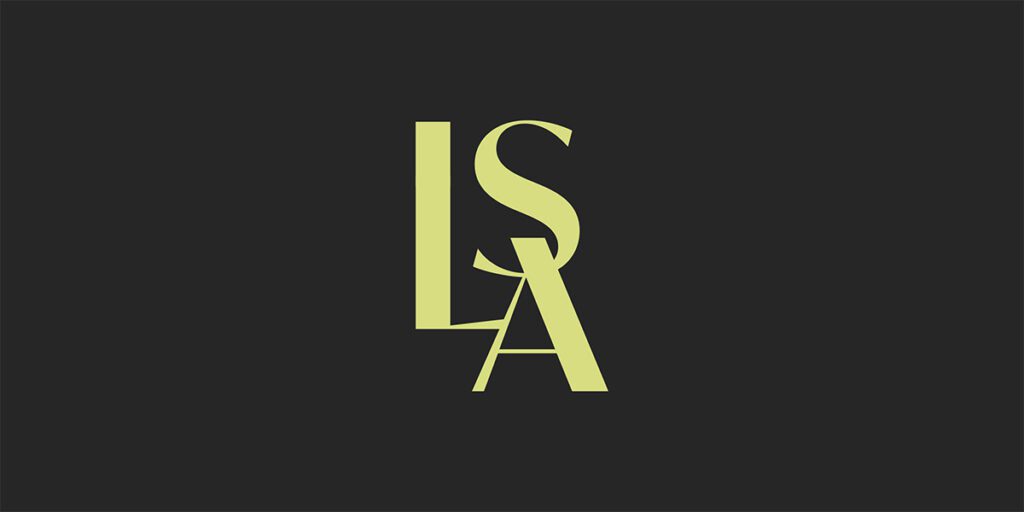
The Logo Design
The logo design features a wordmark made from two typefaces combined. The decorative style highlights the brand’s elevated status. Merging the letters L and A highlighted Isla’s innovative and modern personality.
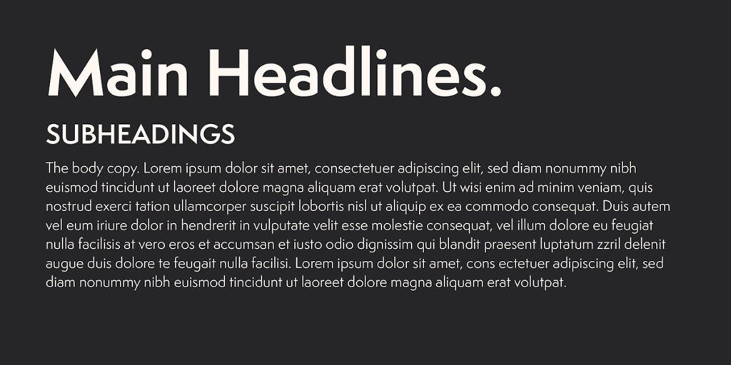
Colors, Type, & Imagery
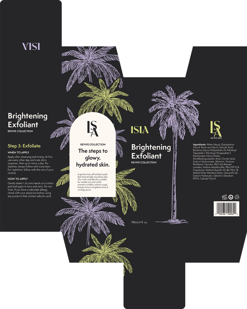
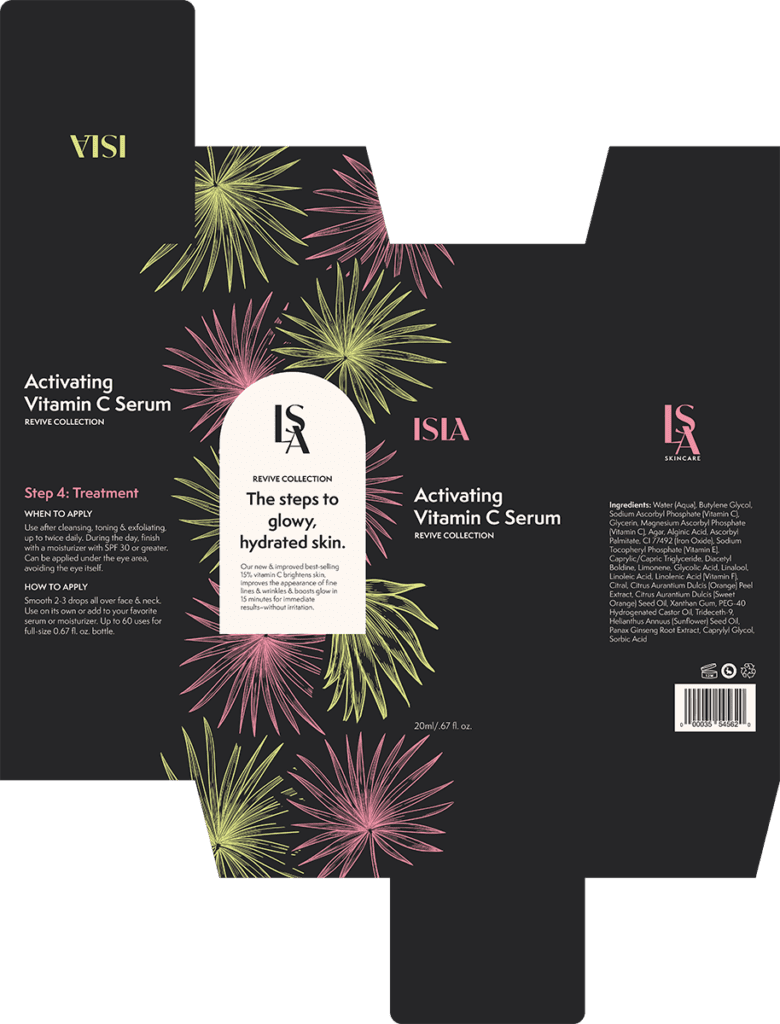
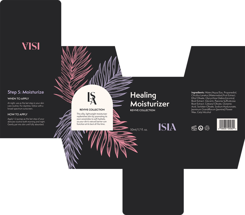
The striking color palette and sans-serif typography highlight the brand’s luxury products with modern benefits. The tropical illustrations tie back to the brand name “Isla,” which means “island.”


Labels & Packaging
The Revive Collection featured three new products that required our design services: exfoliant, vitamin C serum, and moisturizer. We created labels and packaging for each of these products.
