Project Overview
Canyon Springs Health Spa is a fictional luxury resort located in Arizona between the Kaibab Plateau and the Colorado River. Their audience focuses on women in their 20s to 30s who are interested in disconnecting from their busy lives to seek a connection to nature. Canyon Spring’s tagline is, “Go where you feel most alive.” Their most popular spa treatments are massages, facials, body scrubs, and hydrotherapy.
Project Scope:

Brand Strategy
Client Goals
Audience
Canyon Springs focuses on helping businesswomen disconnect from technology, seek natural health remedies, and connect to nature. We wanted our visual identity to persuade members of this audience to visit the spa. We intended our audience to feel Canyon Springs was where they could go for long-lasting health remedies that surpass the expenses.
Messaging
While some spas have white rooms and a very sterile appearance, Canyon Springs is just the opposite. Their rooms are made from local rocks and filled with many plants. Therefore, our messaging focuses on a calm voice connecting the viewer back to nature.
Personality
The core values of Canyon Springs Health Spa are luxury, natural, and femininity. After a clear understanding of the brand strategy, we focused on how to translate these attributes into a visual identity.
Visual Identity
The Logo Design
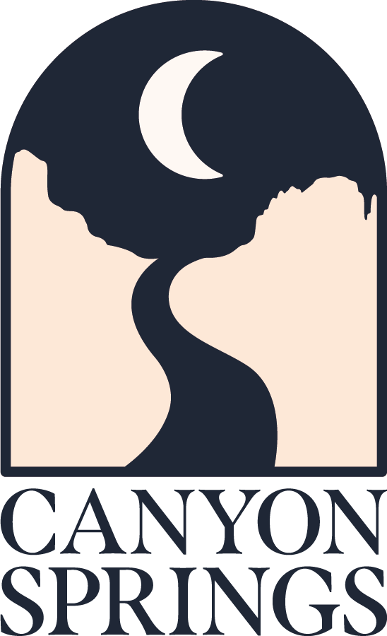
The Canyon Springs logo is designed to feel like a spa guest is peering out a large window onto the Arizona landscape. The moon represents the “C” and the river the “S” in Canyon Springs.
Color, Type, & Imagery
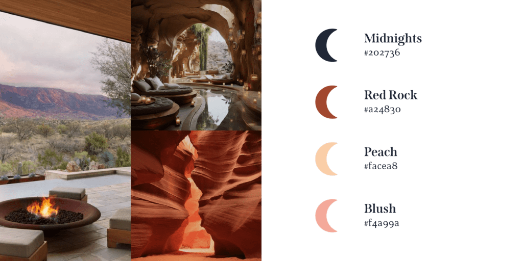
The color palette is inspired by rocks native to Arizona. All together, the color, type, and imagery reinforce the brands feminine and fun brand style.

Marketing Materials
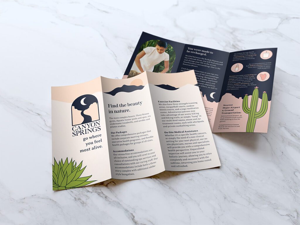
The brochure design uses Arizona landscape elements on the front and back which flow the viewers eyes across the page. The design on the front looks very calm but the back looks very playful. This represents how during the day, visitors enjoy relaxing spa treatments. But at night, the spa comes to life!
Label Design
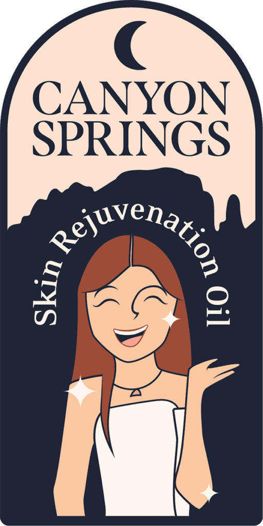
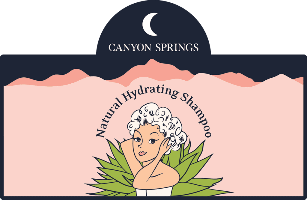
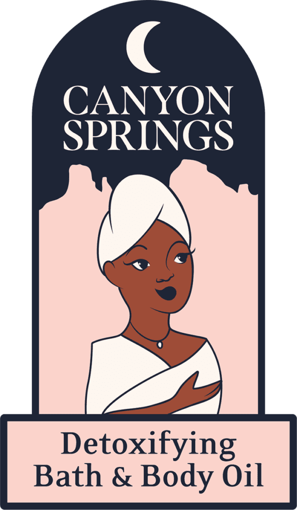
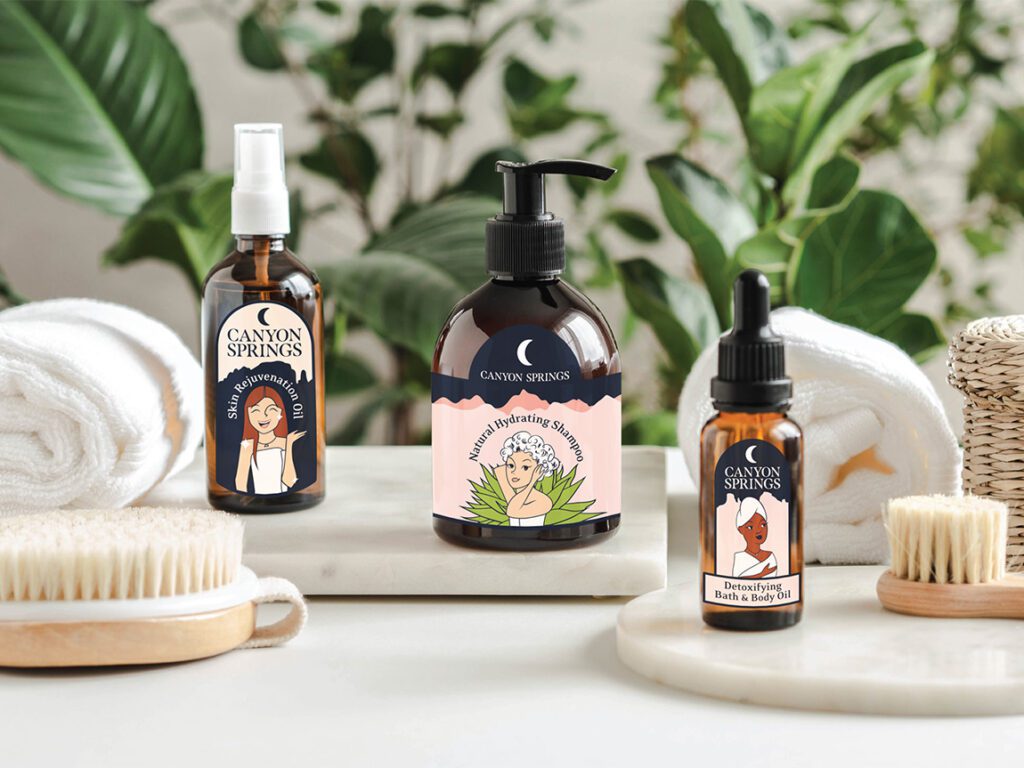
The Canyon Springs Spa uses in-house skincare products. They sell the products for guests to take home as a souvenir. We designed labels for their skin rejuvenation oil, natural hydrating shampoo, and detoxifying bath & body oil. The labels feature fun illustrations of women along with the Arizona landscape.
