Project Overview
Radiant is a fictional skincare brand for preteens. The company noticed that many preteens enjoy doing skincare, but many children are using products meant for adults. The results of this can be harmful. Therefore, Radiant’s aim is to provide skincare products that are simple and safe for preteens to use. Their products include gentle cleansers, toners, moisturizers, and sunscreen. They educate young people on skincare in a way that feels fun, cool, and approachable.
Project Scope:

Brand Strategy
Client Goals
Audience
Our client persona zoomed in on Zoe. She is 11 years old and sees many TikToks of teen girls putting on their skincare and makeup and wants to fit in. She also hears the girls at her school talk about their skincare routines and wants one too. Her mom is looking for a fun and safe option for her daughter.
Messaging
Radiant came to us with a goal of creating a skincare brand that embraces the fun, dynamic, and awkward time before becoming a teenager. The brand educates about skincare in a way that doesn’t feel overly complex or intimidating but instead, fun and safe.
Personality
The core values of Radiant Skincare are fun, approachable, cool, and positive. Our visual identity represented these characteristics through a combination of 1970s themed elements mixed with modern design elements.
Brand Positioning
The brand positioning focused on understanding the characteristics of Radiant’s audience. The age range had already been defined as preteens, but we also needed to outline the pricing, style, psychographics, and personality. After the brand positioning, we began creating the visual identity.
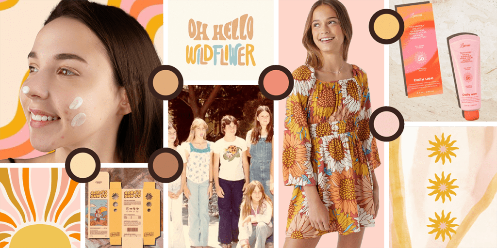
The Mood Board Based on Brand Strategy
The Brand Board
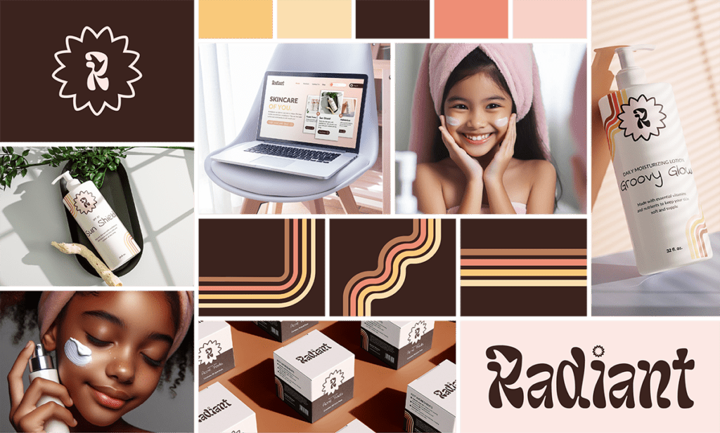
Blu Rose Design crafted Radiant’s brand strategy, focused on being bold, retro, and playful. Our visual identity represented these characteristics through a combination of 1970s themed elements mixed with modern design components.
Package Design
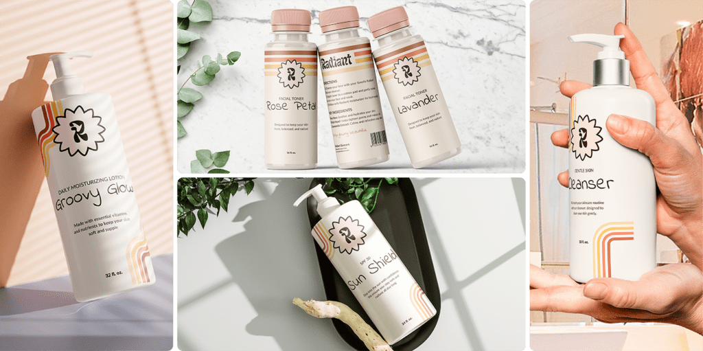
At Blu Rose Design, we create brands that are easy to design with. The skincare product applications are designed to stand out as unique against other skincare lines. We focused on how Radiant could appeal to their young audience. We combined the feminine, neutral color palette and playful attitude of the brand. They also echo the down to earth brand voice by explaining what each product is and clear directions for use.
Digital Applications
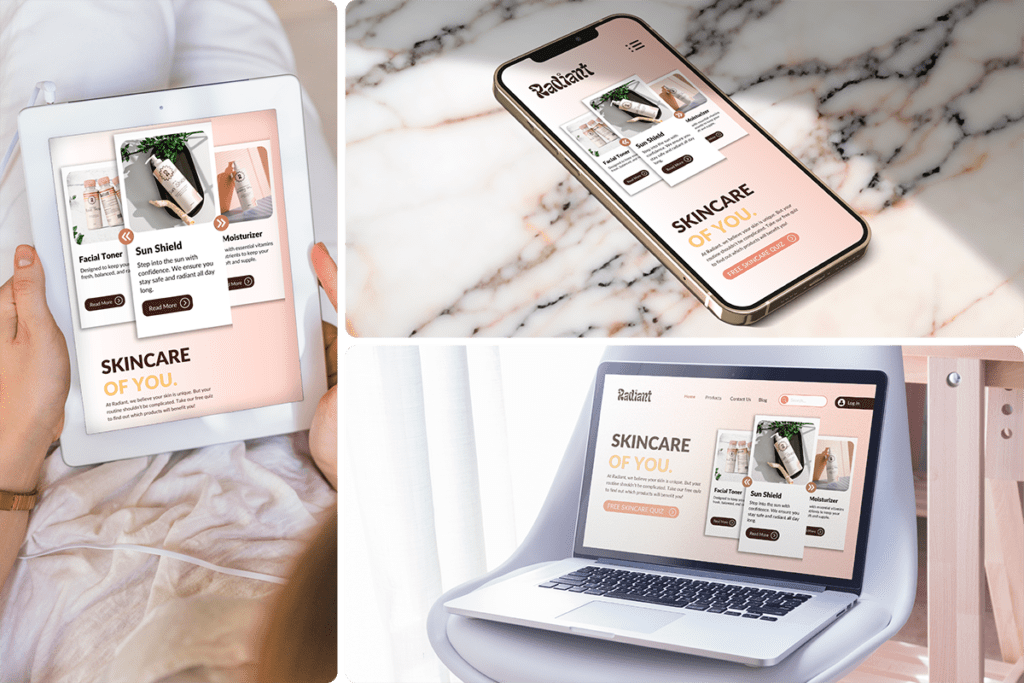
The website applications for Radiant Skincare uses bold visuals and colors to resonate with preteens. There are also interactive elements like fun quizzes and animated buttons to make skincare education enjoyable. We ensured each product includes detailed descriptions, key benefits, and ingredients that make the website informative yet fun. One of our challenges was that our audience was young, so we ensured our website was easy to navigate through clear calls-to-action.
